http://prezi.com/dwc3f6s1x82o/monsters/
Speech to follow
This is the speech that coincides to slides/path numbers in my presentation.
1. Project outline
This is a summary of what I’m aiming for, taking media out of its normal situation then experience of viewing it somewhere new should create some interesting feedback, hopefully making it memorable.
2. Why Awareness?The information that I’ve gathered shows that the reason that there is a lack of the campaigns is down to the waiting queues in hospitals. This is understood until you put yourself in the position of the person in need of help. The reason why I want to push this issue comes down to basic understanding, if someone who is not suffering can understand or give support to the person in need then the problem itself is halfed.
3.Why Mental health?I suffer from depression and anxiety that I pretty much put down to the ignorance of others. Bullying and tormenting during high school, and primary school. To let you relate, in high school ‘neds’ or trouble makers used to throw glass bottles at our group, instead of the instigators being punished/disciplined we were told by the head of year to dress differently. You surly can imaging the anger felt by our parents when the teachers would rather give in to the ‘neds’ than deal with the problem, to “keep the peace” or whatever excuse was said.
This relates to the feeling of the people in need, a little understanding can go a long way.
4.Ontogly
Artists are different from scientists due to how we look at data, we create the data which is then analysed and evaluated, this is different because we don’t always have statics and other number based research. Emotion is the most powerful weapon in art.
5.Whats been done so far?
photo 1 – This one of the light based experiments, we created different gels to see how they effected the scenery, the model and we compare this to how it emotionally effects the viewers.
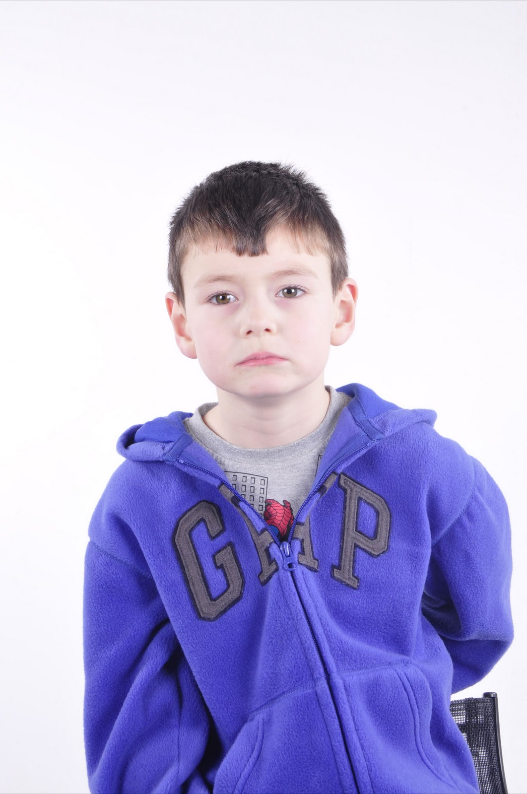
photo 2 – This shows the experiments on the models pose
photo 3 – This is a light experiment, infused with crossing red and blue gels on the barn doors. The model is holding a reflector which is up lighting the face.
The studio experience – it’s been interesting so far. Elaine the owner of the studio, has been a great guide teaching me the tools of the trade.
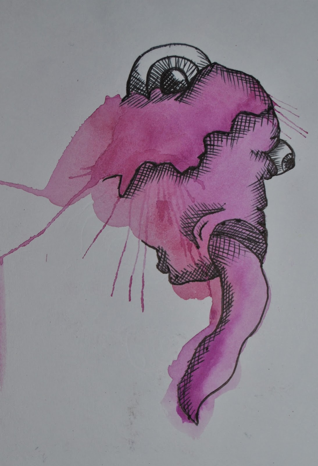
The research into the psychology and biopsychology has been interesting, using it to increase my own understandings. At this moment in time I’m careful not to over complicate my research in to this topic as I have so much to learn in other aspects. (the drawing of the eye was down to my curiosity of finding out how we intact visuals themselves, this relates to other parts of the project)
Sketches- the drawings are from my first sketch book where I’m experimenting with different effects.
The photos which have drawings over them allow me to bridge the gap before experimenting on them digitally.
The Digital roughs are the next experimental stage of the art work, I play with distorting the face, and the layout.
I came up with some accidental findings, like within my photo booth sketch book (the one which I draw over the photos) the glue leaked through the pages, and lifted the ink from the photos imprinting it on the other side. This happened a few times, once over the eyes. This is what drew me to conclusion about the eyes.
The study of other campaigns
the first is the Scottish no knives better lifes video advert - The artist is Blu, one of my favourite street artists. I never realised it was his work despite being a fan until I had watched the video a few times. This stood out to be not very memorably at all.
The campaign also focuses on the life of the attacker, and shows what will happen if you choice that road. This is where the second video comes in, it visually shows how many other people are effected the knife incident.
Personally the second video (English met police) is much more influential and over all memorable, I feel the art styles in the first video talk down to the target audience but I can also see why is was chosen – as a connection to the younger audience, it’s just a shame it wasn’t successful.
Exhibition
Thanks to the psychology research I’ve thought about separating the audience one by one to make the visual experience much more personal, closing the curtain detaches you from the crowd – forcing you to make up your opinion by yourself, hopefully having a powerful effect on your memory. In turn would hopefully make you reflect on yourself and how you judge others.
If I can’t make this, I’ll create hopefully the same feel with some props.
Feedback and question time


 These 3 strips are edited the rest below are not. all the photos from that shoot are recorded here, with signed discloses in my documentation.


.jpg)
.jpg)


